The only thing green this vintage 1970’s terrarium has ever been home to is if some candy happens to come in a green wrapper. It’s never housed any plants, little rock gardens or anything else that one might find in a planter but, rather, has been a big, fat bowl of sweets its whole life. One might assume this only happens around Halloween but this candy bowl may as well be cemented to the floor as you enter my dining room for as popular a piece as it is.

No one has ever accused my house as being a haven for the health conscious. Candy abounds as sugar charged brains fit the mindset of Atomic design, not to mention a house that was built to be a party house year-round as mine was when it was built in 1937 as the party house for MGM. But one thing I can tell you about candy, unless a doctor has given you a skull and crossbones prescription for no sugar, even the staunchest vegan can’t pass up this candy bowl without dipping their hand in.

It doesn’t even look full in this photo but it can hold up to 25 pounds of candy with the lid on. I can’t take a photo of it overbrimming now as everything has been dumped out of it and put in little bags all ready to hand out for Halloween. I don’t dare leave the terrarium out on my porch as I can’t risk that some clown, avatar, angel or cowboy has a developed enough design aesthetic to know that the terrarium is the real treat and not the candy and takes that home instead.

Happy sugarcoated, caramel filled Halloween!

I love this 1950/60s clock radio so much because it looks exactly like can openers of that same vintage did. I kept it in my kitchen for years, and with as much cooking as I did often held a tuna fish can up to it looking for what I hit to make it open. I always pressed this red button expecting some magic magnetized arm to pop out.

All it did was pump out that wonderfully static AM radio sound that I’ll never get sick of.

Even with all the audio equipment I own I’m still attached to the sound of hits spitting out of an AM radio.

When you flip the can opener clock radio around it’s a clock.

I can’t believe that the numbers on it are so conservative looking and not of a more Atomic design. I like my clocks more modern and distinctive looking.

The vinyl that wraps around the radio looks like textured peacock feathers. This was a very popular trend in vinyl and leather the 1960s.

I’ve been collecting transistor radios for decades. The Zenith pedistal can opener clock radio will always be one of my favorites.

What to do with gum when you’re done chewing it or have to get rid of it for whatever reason can be a bit of a muddle if you’ve already thrown the wrapper out, which most people do upon opening. Especially when it’s only a temporary landing and you may want to stick the chewable back in your mouth at a later, through hopefully soon, point. That’s where this Gum Shoe, a place to park your gum, is brilliant. Though I can’t say I really understand its construction as so little of the real estate is devoted to the concave surface upon which the gum is to be placed. Unless it’s for a lot of different people’s gum, in which case the heel and all surfaces of the base seem like prime resting spots as well. Though that seems so gross, a bunch of little germ mounds begging to be redeposited in the wrong mouths. So I just keep my Gum Shoe on the windowsill in my kitchen where it’s also home to rings and anything else that may need to be redeposited on my body once I leave the sink area.

I always love handmade crafts, especially these Knit-Wit kind of animals, usually poodles, that are more often than not made to fit over either liquor bottles or toilet paper. This one with the wayward tongue was made to fit over toilet paper but the crafter either ran out of yarn or was sneaking nips from the bottle as they only equipped the canine with a mini skirt, not enough to even pull over a full roll.

And here’s how she looks over a liquor bottle:

Here she is with a roll of toilet paper fully inserted:

Here’s a normal size roll of toilet paper and the much used roll of toilet paper that was able to fit inside the poodle.

Obviously, this poodle cannot efficiently to do her duty covering either of the objects she was meant to serve. All of which would be a total drag if she weren’t so damn cute. She can just sit here with her googly eyes and do a half-ass job and I still love her.


Here’s a video tour of my trip to visit Dona Miller, President of Vogue International, a 22,000 square foot wonderland  of mannequin bodies and parts in The City of Industry, CA. You can’t believe how massive this place is and what a science there is to mannequins.  Enjoy the video!

Hope you are having a big, bulging mannequin Monday!

Revered as much for his marriage to cuchi-cuchi girl, Charo, as for his spreading the gospel of bouncy  Latin music and rhythm, Xavier Cugat led the band at New York’s Waldorf Astoria Hotel and toney resorts around the world with his signature batons, one of which was real and the other of which was his pet Chihuahua. Cugat was a multimedia artist before his time, a musician, painter, cartoonist, movie star, business man and ladies man, husband of five steamy women, including the lead singer of his orchestra at its height, Abbe Lane.

Legendary enough to be mentioned in the third scene of A Streetcar Named Desire, his name frequently sprinkled throughout I Love Lucy, and even a Ben & Jerry’s ice cream flavor named after him in an episode of The Simpsons, “Xavier Nougat”, Cugat  brought such exuberance and flair to a performance that his signature Tango, Rhumba and Merenge rhythms will forever be recognized, as will his self portrait caricatures.

You gotta love a guy who leads a band with a Chihuahua…

… and marries this:

Cugat was a happy man.

And I’m toasting him today.


I never learned how to play Chess. Checkers was way more my speed, especially as I loved the sound the vintage wood ones made as you plunked them down on the board. Plastic ones sounded good too and that was about as complex thinking as I was willing to ponder when it came to games. My standards were always based on design, what sound do the game pieces make, how do they feel texturally, how’s the color palette, etc.  Mind  you, I love the sound these plastic Chess Men make clicking together too. But for Chess you also have to burrow way deep into your brain to strategize about where to move them and I like to reserve those deep recesses for things like writing songs, painting and knowing the quickest routes to local thrift shops.

One thing I could always wrap my brain around though was excellent packaging. And the color technique for cheap, stripped down, straight-to-the-point things like Chess was excellent in 1969 when this was made.

My cat, Niblet, has developed a crush on the box. She’s very attached to sleeping right next to it, in this case on a lucite chair right under it, and stretches every time I shake the box.

I have too many deadlines and too many other things I should be attending to now besides stopping and finally learning how to play Chess. So this gorgeous vintage box and its contents shall just act as a collectible artifact and cat sitter until the time my brain feels there’s space to wrap itself around things like King’s, Queens, Pawns and whatever all the rest of these beautifully sounding pieces are.

It’s been dripping for days in LA. I used to spend so much time looking for my umbrella, the rain would end before I even made it outside. So began my umbrella collection. Of course, then I could never bring myself to use any of the vintage ones I collected because they would get ruined in the rain. So I started buying a bunch of cheap ones, of which this lipstick umbrella, picked up at the 99¢ store about 10 years ago, was one of my favorites. But it’s soooooo cheap that the first time it rained after I bought it I never got it to fold up again to fit back into the cheap white plastic tube. Soooooo cheap that even just lying in my purse the tube got poked full of holes from my pens. So I tossed my crippled lipstick umbrella out and headed back to the 99¢ store where I bought the last one on the shelf and committed to never opening it so I could preserve its lipstick loveliness. This became a persistent problem every time it rained as I struggled whether I should get my one-time-only use out of the umbrella or preserve it for my kitsch collection as I was also always the type to leave my umbrella at whatever destination I happened to be in should the weather have cleared before I left to come home.

Everything changed when I started buying golf umbrellas. This started when I was spending so much time in New York for my musical, The Color Purple, and had to schlep around computers, keyboards, books and whatever else it took to emulate my studio and work habits back in LA. What a revelation the golf umbrella was! All of a sudden, I didn’t need to decide whether the back half or front half of me was going to get wet or whether my body would stay dry but I’d sacrifice my purse or backpack to the elements. As long as you had a hand to carry it or a way of balancing it against some body part, a golf umbrella was like having your own private building move with you. Of course, it’s ideal to be of a certain height and you MUST have street sense while using it, but for me this was definitely the way to go. These days I always have enough golf umbrellas at any one time that I never again have to worry about losing my umbrella.

Which means that I don’t have to disrupt the sanctity of the not-really lipstick umbrella by removing its plastic tube. Or having to deal with its un-ergonomically designed the little lipstick nub handle once its opened.

If you see anyone walking around LA today looking like this it’s me.

There’s absolutely nothing right about this insanely cheesy Kahlúa “Udderly Delicious”plastic glass which, unfortunately, there’s no way of taking a photo of and showing all the brilliance of at once. At first glance, it’s just an incredibly cheap cup with the Kahlúa logo and some cow spots painted on it. Plus the excellent “Udderly Delicious” slogan. But then you peer inside and see the creature that the udders belong to with a nice frosty drink on its head and two toy bottles, one of which is unmarked, which makes no sense for something that’s a promotional item, rattling around inside on top of it.

As beautifully kitschy as this cup is, one sip from this thing and I would be over the novelty quick as plastic knocks against plastic every time you take a swig, making for an all too loud clunking sound happening way too close to your ear, not to mention that it looks like the bottles are going to fall into your mouth. All of which makes for a perfect kitsch drinking experience should you be up to the task.

Thank you, aKitschionado Denny McLain, for sending this Kahlúa kitsch my way. You are all the more “udderly delicious” for it.

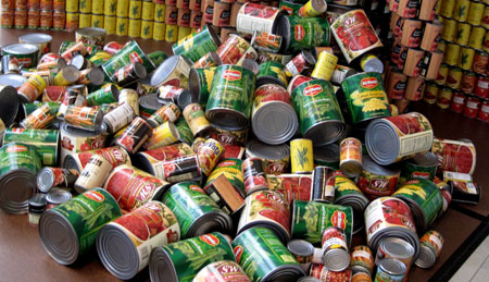
I’ve always been intrigued with label design, especially when appearing on cans, as the designer has to take the roundness into consideration as well as the inescapable fact that only a portion of the design is going to be seen at any one time. But then imagine having to stack the cans so they become something else. The label still needs to retain its power but must also give power to whatever structure you’re using it to make. This weekend I had the honor of judging and announcing the winners at the Los Angeles Canstruction awards, a design contest that takes place in over 100 cities where designers compete using canned food as the building blocks to make a variety of giant objects.  After the contest, all of the food is donated to local food banks, so the quality of the meal provided in each structure is a very important criteria in judging its worth.

At first glance it might look like someone just plopped a bunch of cans on top of each other, but the four categories each object is judged on speak to the intricacies of building such a design. There’s also a winner in each individual category.

1) STRUCTURAL INTEGRITY – This is a killer category because all structures must be self-supporting. You can’t use 2×4’s or anything over half inch plywood to support the cans. The only materials permissible are quarter inch or less foam core or plywood, cardboard, Masonite or plexiglass, and those can only be used for leveling or balancing and not for load-bearing. As far as attaching things to each other, you can only use Velcro, clear and double sided tape, rubber bands, fish wire, wire, plastic ties and magnets, none of which can be visible. And absolutely no glue is allowed. So these things are really feats of engineering.

The winner in Structural Integrity category was “Cancave/ CANvex”, built by HMC Architects and Buro Happold Engineers. This structure used none of the aforementioned items to hold it together but rather, each row of cans was supported by the weight of the next to hold together.

canstruction-wave._2734

The wave, however, was a little light on nutritional variety. It consisted solely of cans of Dole pineapple.

canstruction-wave_2735

2) BEST MEAL went to “Not So Hungry Hungry Hippo” by RTKL Associates.

The hippo included lights and had the most appetizing collection of food: whole peeled tomatoes, cut green beans, mixed vegetables, ravioli, tuna, lychee jelly and Pringles.

3) BEST USE OF LABELS – The most creative use of graphically strong labels went to “CANucopia” by Perkins & Will.

It’s hard to see from the angle of that photo but brown cans of crushed tomatoes formed the shape of a cornucopia that food including my favorite, pork ‘n beans, spilled out of.

cantruction-canucopia_2736

4) JUROR’S FAVORITE – This award went to the canstruction that best combined all of the above categories. The winner was “Can-on, Picture a World without Hunger” by Gensler and Arup, a giant Canon camera built out of black beans, peas, green beans and tomatoes. This design was really intricate. As I rely so much upon my Canon Elph to capture the images I feature every day here in Kitsch O’ The Day, I can tell you they got every little feature on the camera.

canstruction-camera_2722 canstruction-camera_2723

The structure also integrated technology. Two screens featured a  live streaming video of people looking at it as well as a presentation of images of people who will benefit from the food donations.

canstruction-camera_2724

I don’t have that many vintage cans of food in my Kitsch collection. Of the few that I have, I’m most attached to my canned ham and my can of Popeye’s Spinach.

I had two cans of Popeye’s but used one in 1988 in my motorized art piece I built to match my song sung by Pet Shop Boys and Dusty Springfield, “What I Done to Deserve This?”.

popeyes-WHIDTDT-4X5

This piece is over 9 feet long and weighs close to 400 pounds. That’s because of all of this on the back:

popeyes-WHIDTDT-motorized-back

You can actually see it moving here. You can see a nice close-up of the spinach can here.  You can see everything you’ve ever wanted to know about the art and music of “What I Done to Deserve This?” here.  But this post is about cans of food, not motorized pieces that I only have really crappy photos of. And it’s certainly about cans of food that held up better than the Popeye’s can I still have.

I have to assume that it’s the spinach itself that seeped through the tin and attacked the label. When you pick the can up it’s packed so tight the lids are convex at both ends. I know that’s not the way the spinach originally came when it was made back in the 1960s or 70s as I found this photo on the web of someone who actually measured how much spinach Popeye was packing. A full third of it was liquid.

I’m confidant that the food making up the Canstruction entries was all nice and fresh and not the kind that could blow the roof off of your house.